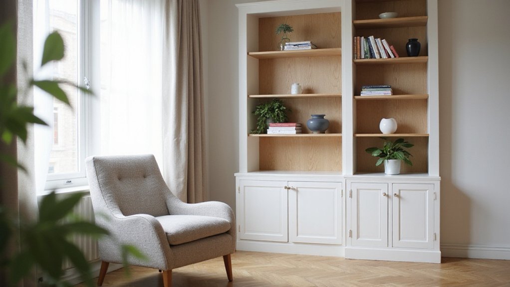
Wondering how to make your bookcase look stylish without feeling cluttered? The key is in how you top and arrange items—using a statement piece, balancing heights, and mixing decor in odd numbers. Get these details right, and your shelves will feel curated yet inviting.
The rest of this guide will show you how to create a polished look that anchors your space.
How to Pick the Perfect Focal Point for Your Bookcase Top
To pick the perfect focal point for your bookcase top, start with size and scale. Choose a piece that fills the space without touching the ceiling or crowding the edges. An oversized sculpture or large vase works well, as it creates visual impact without overwhelming the entire shelf. Position it at the center or slightly off-center to add a modern, asymmetrical look that draws the eye. For a cohesive look, you can even build a custom closet system to match the scale of your bookcase display.
Next, focus on color coordination. Select an artifact that complements your room’s existing palette. A piece in a bold hue or with interesting patterns can serve as an eye-catching anchor, tying the room’s elements together. If you prefer a more unified approach, consider installing a DIY closet rod in a matching finish to extend the same aesthetic into adjacent storage areas. For long-lasting organization, you might also apply smart shoe storage methods to keep nearby footwear neatly arranged.
Add texture contrast to prevent your display from feeling flat. Pair a smooth ceramic vase with a rough organic element like driftwood, or set a polished metal orb beside a woven basket. This interplay of textures enhances visual interest and depth.
Finally, pay attention to placement and repetition. Limit yourself to one standout item per section if your bookcase has multiple areas. This bold choice provides a focal point that grounds your entire arrangement and guides the viewer’s eye naturally.
Group Decor in Odd Numbers for Visual Balance
Grouping decor items in odd numbers—three, five, or seven—creates a more dynamic and intentional look than even groupings. Odd numbers naturally draw the eye inward, helping you establish a central focal point that anchors your arrangement. For example, grouping three objects around your main piece can frame it beautifully while maintaining a sense of movement and fluidity. Mix varied heights, shapes, and textures within these groups to add depth and visual interest—think a tall vase, a stack of books, and a round sculpture. Leave ample negative space between items to give each piece room to breathe. When stacking books, placing two vertically rather than side-by-side creates that necessary odd count and enhances the organic, less contrived feel of your vignette. This approach ensures your display feels balanced without relying on stiff symmetry, keeping the eye flowing naturally across the shelf. For a similar sense of rhythm in the kitchen, grouping pots and pans in odd numbers can also create visual order while allowing each piece to be easily accessed. To ensure heavy decor items stay securely in place, consider using wall anchors in drywall for additional support.
Match Focal Point Size to Shelf Width
Match focal point size to the shelf width by ensuring the main piece does not exceed 80% of the shelf’s width. For a typical shelf, this usually translates to a focal item no wider than 7.2 inches on a 9-inch shelf or about 9.6 inches on a 12-inch shelf. This proportion creates breathing room, preventing the display from feeling crowded and allowing the eye to rest.
In terms of depth, aim for the focal piece to occupy roughly 60% of the shelf’s depth. For a shelf that is 9 to 12 inches deep, keep the item between 5 and 7 inches deep. This prevents overhang and maintains shadow lines, which contribute to visual stability and coherence. Placing your knife block too close to the edge can similarly disrupt visual stability and coherence in a kitchen layout.
Balance the main focal point with smaller accents nearby, shifting the visual weight toward the middle of the shelf. Use cohesive color themes between your focal piece and surrounding decor to unify the display, while contrasting materials—like a smooth ceramic vase against a rough wooden shelf—to draw attention. Avoid placing two items of equal size side by side, as this dilutes the focus. Keep the arrangement intentional and free of clutter for a clean, impactful look.
Stack and Lean Books for Height and Rhythm
Using a variety of stacking and leaning books creates height and rhythm on your shelves. Start by horizontally stacking books to serve as risers, elevating vases or ceramics and adding visual interest. Practice leaning books vertically against the back wall or alongside other objects to shoot lines upward, instantly increasing height. Overlap these leaning books with standing items to break up flat, uniform lines and introduce dynamic layers. Just as the system emphasizes keeping weight on the left for consistent ball contact, use firm horizontal bases to anchor your stacks for stability.
For rhythm, replicate a specific lean angle across multiple shelves to establish a visual flow that feels natural. Group stacks in odd numbers, like three or five, to enhance visual appeal and avoid symmetry that can look too rigid. Mix spine colors within stacks or leaning patterns to tell a cohesive visual story without creating visual chaos. Ensure all horizontal stacks are tight and level to safely support items placed on top, providing stability and a polished look.
Tuck Greenery Into Vignettes for Organic Softness
Tucking greenery into your vignettes provides organic softness by blending the hard edges of books and objects. To create balance, group a leafy plant with a book and a decorative item following the Rule of Threes. Mix tall snake plants with wide-leafed ZZ plants to introduce foliage contrast, varying their heights for added depth. Position larger anchor plants at the ends of shelves and stack books horizontally underneath smaller pots to elevate them. Incorporate trailing plants like heart-leaf Philodendron near framed prints, allowing vines to drape around the frames for a natural look. Pair your greenery with earthy textures such as terracotta pots or twine-wrapped jars. Always assess the light levels of your space; for shaded spots, low-maintenance pothos work best. To add visual interest, trim a Monstera leaf to create accent stems throughout the vignette and include small personal touches, like a travel trinket, for a curated appearance. Using repeated elements like similar trailing vines on opposite sides of the bookcase helps establish visual rhythm and harmony. For a similar functional yet decorative approach, consider incorporating a mirror cabinet to reflect light and add depth to your display. If you prefer to display these plant pots on custom supports, DIY wooden shelf brackets offer sturdy and stylish shelving options that can be built to any size. To protect delicate fabric items near your bookcase display, store off-season clothing using breathable garment bags to prevent dust and moisture buildup.
Add a Lamp to Your Bookcase Top for Warmth
Choose a lamp that is 25 to 30 inches tall with an 8 to 12-inch base to ensure stability and proportion on your bookcase top. Spherical lamps with flat bases or small designer table lamps are ideal as decorative accents and help keep the setup balanced. Opt for plug-in models for reliable power supply, or battery-operated lamps if outlets are limited. Warm white light with dimmable features creates a cozy ambiance and gives you control over brightness. Stack a few books under the lamp to showcase its shape, and consider adding a small potted plant nearby for texture. Using a pegboard system for organizing small accessories nearby can keep the wall space functional and free of clutter. This arrangement adds warmth and visual interest without cluttering the surface. Applying practical storage ideas from smart kitchen cabinet organization can help keep decor items tidy and prevent the bookcase top from becoming crowded. To ensure the bookcase shelf itself can support heavier items like stacks of books, consider using heavy-duty shelf brackets for added stability.
Display Framed Art Leaned Against the Back Wall
Leaning framed art against the back wall creates a casual, gallery-like vibe. Start with larger, heavier frames placed directly against the wall, then layer smaller pieces in front to add depth. Use museum putty on the bottom corners of each frame to prevent slipping. A matte finish on your frames helps reduce glare and complements the overall look. To ensure proper wall clearance, angle the tops of heavier frames 2 to 3 inches away from the wall and secure them with discreet L-brackets. Vary the sizes of the frames and maintain a ratio of two small pieces for every large one to achieve visual balance.
Place shorter accessories or stacked books in front of the frames to anchor the display without crowding it. Make sure all frames stay within the depth of the bookcase for stability. This layered approach results in a cohesive, intentionally styled vignette that enhances your bookcase decor.
Cluster Personal Mementos in a Corner Vignette
To create a compelling corner vignette with personal mementos, focus on establishing depth and visual weight. Start with a tray or a flat book stack as your base, which helps contain the arrangement and prevents clutter. Choose one anchor object, such as a lamp or sculpture, to ground the display and give it a focal point. Apply similar principles of sorting and arranging every item to your mementos, ensuring each piece has a designated purpose and place within the vignette.
Build layered depth by placing taller items behind shorter ones. Select one or two meaningful pieces—like a handmade ceramic or a travel souvenir—to serve as the narrative drive. Surround these with simpler support objects to highlight their significance without competing for attention. To maintain order, apply practical methods to sort your keepsakes before placing them. Group items in odd numbers and overlap them slightly for a lively, dynamic look.
Use a cohesive color palette of two or three tones, repeating materials like ceramic or timber to unify the collection. Keep most finishes matte for a subdued background and add a single metallic accent to introduce a subtle sparkle. Leave negative space in one corner to provide visual breathing room and avoid a crowded feel. This approach results in a personal, nostalgic vignette that feels curated and intentional rather than cluttered.
Cap It Off With a Single Statement Object
A single statement object at the top of your bookcase should be proportionate to the space. For narrow shelves, opt for a tall pottery piece to enhance vertical impact without overwhelming the unit. For wider cases, a large rectangular basket creates a balanced focal point that anchors the entire display. Keep the object at least two feet below the ceiling to avoid crowding the space and ensure it feels intentional. For a wider bookcase, consider a 40 inch wide bookcase with doors to provide a sturdy and proportioned base for your statement piece. A similar principle applies to kitchen cabinetry, where top cabinets with plate racks offer both function and a balanced focal point.
Choose a piece that harmonizes with your room’s color scheme. If the bookcase matches the wall and ceiling colors, leave the top bare to maintain a cohesive, seamless look. Otherwise, select an object with colors that complement or add contrast, creating visual interest without clashing.
Limit your top decor to one strong object to prevent clutter. An abstract sculpture or decorative accent works well and contributes to an intentional, curated aesthetic. Maintain a filled-to-empty ratio of roughly 70/30—paring down the number of small items allows your statement piece to truly stand out and anchor the entire unit.