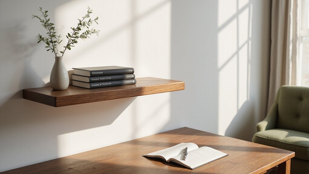
Thinking about sprucing up a wall shelf but unsure where to start? You can create a stylish display by choosing just three to five key decor items and sticking to a simple color palette.
Arranging objects in odd numbers, mixing textures, and leaving some space can make your shelves look clean and thoughtfully curated.
Keep reading for easy tips to pull it all together.
Remove Clutter by Keeping Only Three to Five Core Items
Limit your shelf display to three to five core items. This small selection helps prevent visual clutter and creates a more intentional look. Use odd numbers, such as three or five, because they tend to feel more dynamic and balanced. Group items by color to create cohesion, ensuring each piece complements the others without competing. Mix different materials—ceramic, wood, metal—to add texture and visual interest. For heavier pieces, ensure they are secured using wall anchors to prevent tipping. Consider using adjustable pegboard hooks to securely hang lightweight decorative items if your shelf incorporates a pegboard backing. Adopting practical methods from kitchen storage can inspire more functional decorative displays.
Arrange your pieces in a triangular hierarchy: place a tall item, a medium one, and a short one together. This setup guides the eye smoothly across the display. Leave negative space around each object to let them breathe and stand out. Prioritize variety in shapes and textures, like pairing straight-edged books with a rounded vase, to maintain visual interest. This approach keeps your shelf looking curated and harmonious instead of cluttered. Extend this rhythm by using an upside-down triangle pattern on the opposite shelf to build visual coherence.
Stick to a Three-Color Palette for Wall Shelf Styling
Limiting your shelf to three to five items requires controlling color to maintain cohesion. Start by choosing one main accent color, then pair it with one or two neutrals already present in your room. This approach creates visual harmony without overwhelming the space. Ensure every object on your shelf falls within those three color families to keep the palette consistent. Repeat the accent hue across various items to create a sense of continuity. Use a monochromatic base such as white, beige, or soft gray to establish a sleek, calming foundation. Layer metallics or complementary accents over this base for subtle variation. For lasting organization, group similar items by function to prevent clutter from returning. Deliberately balance warm and cool tones as you arrange the objects on your shelves to avoid clashing undertones. For a built-in storage solution, consider crafting a custom knife block to securely store blades while freeing up counter space. This method adds depth and interest without clutter, resulting in an intentionally styled shelf. For a practical display, consider storing dishware in kitchen cabinets with plate racks to keep your favorite pieces both accessible and visually organized.
Group Decor in Odd Numbers and Stack Books for Height Variation
Grouping decor in odd numbers—three, five, or seven—creates a more dynamic and intentional display. Your eye naturally moves across the arrangement instead of splitting it into equal halves, which adds visual interest. This method helps break symmetry and encourages you to rely on height variation to achieve balance. Practical guidance for designing your perfect bookshelf often emphasizes this rule to ensure a curated look.
For a single shelf, stick to a trio: one tall piece between 25 and 34 centimeters, one medium piece around 16 to 21 centimeters, and a small accent measuring 10 to 16 centimeters. Stack books to form low or medium platforms, which can lift smaller objects like votives or ornaments. Using books in this way introduces vertical layers without requiring tall standalone items.
Position your tallest item slightly off-center rather than in the middle. This off-center placement guides the eye across the group, creating a natural flow. Such an arrangement prevents a static, symmetrical look, making the display feel intentionally curated and engaging.
Pair Matte Ceramics With Shiny Metal for Texture Contrast
Pairing matte ceramics with shiny metal creates a striking texture contrast that adds visual interest. The key is to place these finishes side by side; matte ceramics absorb light, while shiny metals reflect it, amplifying their differences. For example, positioning a matte ceramic vase next to a polished brass candle holder immediately highlights their contrasting surfaces.
Enhance this effect by considering their placement on the shelf. Placing a matte ceramic piece alongside a reflective metal accent ensures each surface’s qualities stand out. The reflected light from the metal scatters a gentle sparkle across the space, especially under warm lighting, while the matte ceramics absorb that glow, creating depth without excess glare.
Distribute the materials thoughtfully to maintain balance. Mix rough, earthy textures with smooth, polished metals—think matte ceramics paired with glossy bowls on a matte black tray. Arranging these items in a zigzag pattern prevents clustering all matte or all shiny finishes in one area, allowing each surface to do its visual work. Let each piece’s surface behavior complement and contrast with its neighbors for a cohesive yet dynamic display.
Finish With Negative Space, Warm Brass Lighting, and a Single Plant
To finish a wall shelf beautifully, reserve about one-third of the shelf surface as empty space. Use negative space to create a clean, uncluttered look that allows each item to stand out. Avoid filling every spot; instead, select a few key pieces and arrange them with intentional breathing room. This approach keeps the shelf feeling open and balanced, making the display more visually appealing. Prioritize impactful decor pieces over excessive small items to maintain clarity and visual hierarchy.
Add warm brass accent lighting to enhance the display. Install a small battery-operated lamp at medium height to serve as a cozy focal point. Place it near glass objects to produce gentle, warm reflections that add depth. Choose bulbs with a color temperature around 2700 Kelvin for a soft, inviting glow. This subtle lighting creates an ambiance that highlights your curated items without overpowering them.
Finish the arrangement with a single trailing plant, like pothos, placed near the front edge of the shelf. Let the plant spill over the edge to introduce organic shape and soften straight lines. A single plant keeps the look simple but adds natural texture and movement, balancing the negative space and brass accents for an effortless, cohesive finish.